
Who
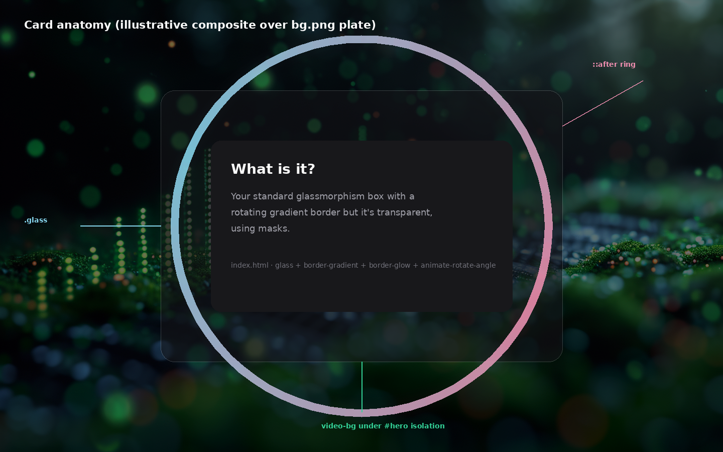
I wanted the usual glass card with a rotating gradient border, and I wanted to see the video plate through the middle of the ring. A filled conic disk sitting on top of the glass was the wrong shape for the lab.
For front-end operators who already know conic-gradient and still lose an afternoon when the border paints the whole card. Especially anyone comparing this lab to my Next.js glass-design-system AnimatedBorder and needing the bare CSS cut.
What
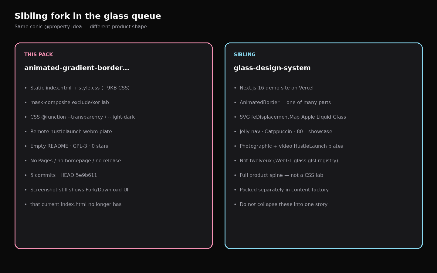
I built animated-gradient-border-on-transparent-background, public michaelmonetized/animated-gradient-border-on-transparent-background. HEAD 5e9b611. 5 commits. 0 stars. Language CSS. License GPL-3. README is empty (0 bytes). No version tag. No GitHub Pages. No homepage.
Product is a static lab:
index.html, 31 lines. Title: Glass Animated Gradient Border. Card classes:glass rounded border-gradient border-glow animate-rotate-angle.style.css, 448 lines (~8.9KB). The technique lives here.- Plate:
#hero+.video-bgpointing at a remote HustleLaunch webm (attraction-silent-backdrop.webm). Repo also carries localvideo.webm(~47MB) andbg.png. - Toggle: fixed darklight checkbox flips ☀️/🌙 via
--schemeand:has().
The border trick:
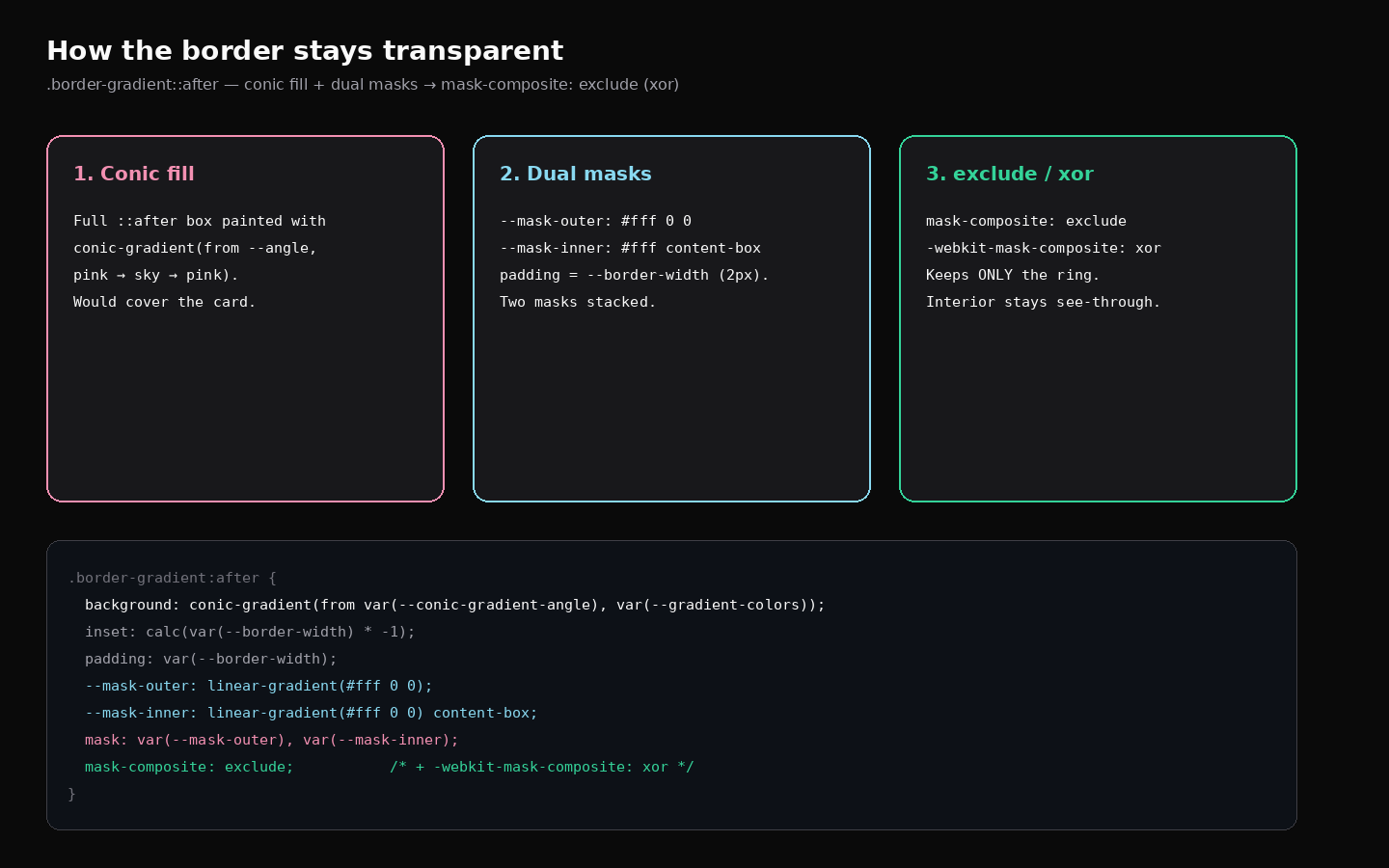
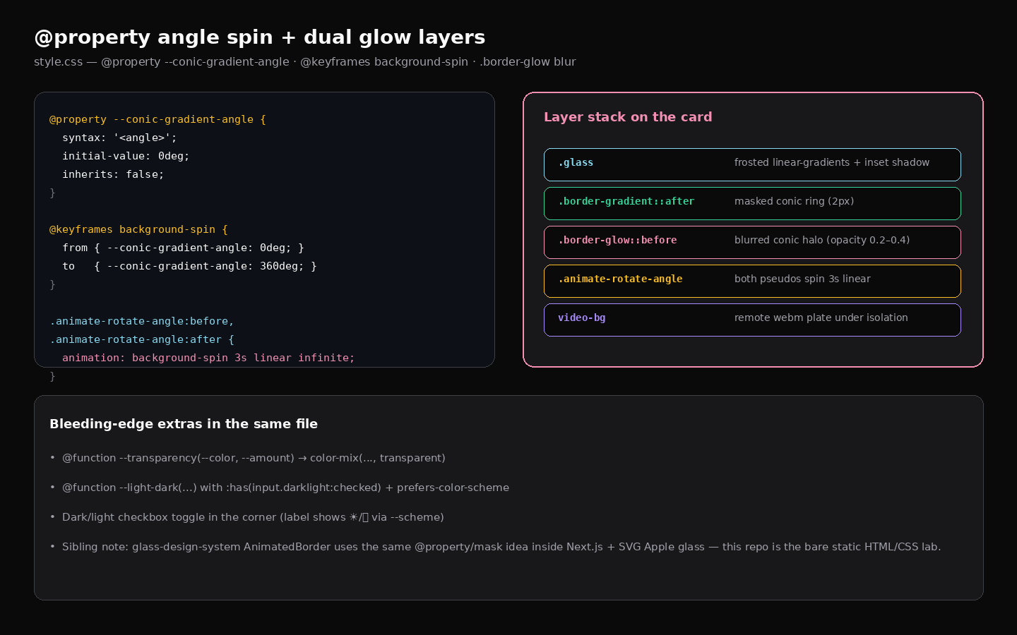
::afterpaints a full-boxconic-gradient(from var(--conic-gradient-angle), …).- Dual masks, outer
linear-gradient(#fff 0 0)plus innercontent-box, withpadding: var(--border-width). mask-composite: exclude/-webkit-mask-composite: xorkeeps only the ring.
Spin comes from CSS @property --conic-gradient-angle (syntax <angle>) and @keyframes background-spin 0deg to 360deg, applied to both ::before (glow) and ::after (ring) at 3s linear infinite. Glow uses a larger inset, filter: blur, and --intensity-glow (0.4 light / 0.2 dark).
Same file also ships experimental CSS @function --transparency / --light-dark wrapping color-mix and scheme branching.
Sibling fence: glass-design-system reuses the @property + mask border idea as AnimatedBorder inside a Next.js 16 Apple-SVG glass showcase. This repo is the bare static HTML/CSS lab. Separate from that product spine and from twelveux WebGL glass.
Residue I am not papering over:
- Empty README.
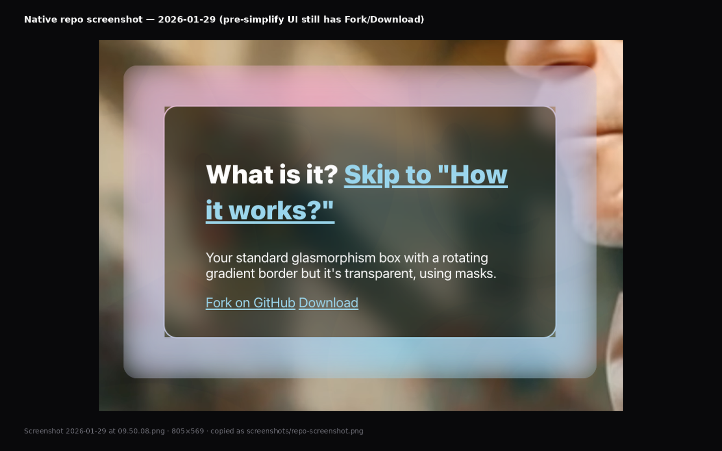
- Native screenshot from 2026-01-29 still shows "Fork on GitHub" / "Download" and a "How it works?" skip link that current
index.htmlno longer has. - Two empty commits: second
simplifiedshares tree with first; secondnightlyshares tree with first. video.webmin-tree while the page loads the remote URL.
Where
Code: github.com/michaelmonetized/animated-gradient-border-on-transparent-background, public. Open index.html locally (needs network for the remote webm plate).
git clone git@github.com:michaelmonetized/animated-gradient-border-on-transparent-background.git
open index.html   # or any static server
When
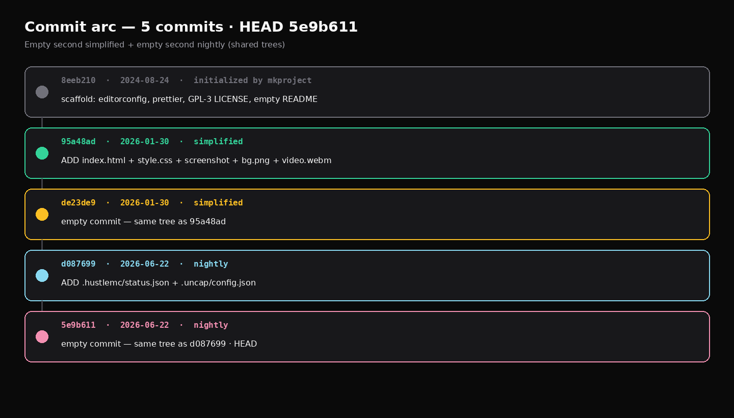
2024-08-24. 8eeb210 mkproject scaffold (editorconfig, prettier, GPL-3 LICENSE, empty README).
2026-01-30. 95a48ad / de23de9 "simplified": demo HTML/CSS + screenshot + bg + video; second commit empty.
2026-06-22. d087699 / 5e9b611 nightly: .hustlemc + .uncap; second nightly empty. HEAD.
Repo GitHub created_at is 2026-01-30; the mkproject commit timestamp is 2024-08-24 (history carried in).
Why
A gradient border that fills the card is a different product than a ring you can see through. mask-composite: exclude is the sentence that makes the middle transparent. The static lab should stay distinct from the Next.js glass design system that absorbed the same border pattern.
Engagement Q: Fill the empty README with the mask-xor recipe and retire the stale Fork/Download screenshot, or leave the repo as a raw lab and point operators at glass-design-system for the polished story?